
Syndicate

| Title | Hits |
|---|---|
| Theming the register form in Drupal 6 | 632281 |
| True or false in php | 409689 |
| Theming the contact form in Drupal 6 | 248235 |
| File download in Drupal | 212214 |
In this article, I will explain one way of horizontally centering a shrink-wrapped block element inside another block element using additional markup (an extra div). The problem is: You can not easily center a block element without first knowing something about its width. You can easily center a sized or stretched, static or absolutely-positioned, element, yes, but centering and shrinkwrapping a block element is quite a challenge!
To illustrate the solution, I'll provide a real-world and simple enough example: a footer of unknown width which content we want centered.
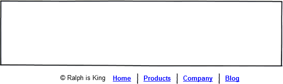
The Client in my made-up story is a cheap bastard that goes by the name of Ralph. He is somewhere between an Under-Valuer and a “I-Could-Do-This-Myself”-er (on how to deal...), and Ralph wants you to add this footer to his website (The big EMPTY box here is the lower part of his website's content):
Most designers would line up the text in a single paragraph, using the vertical bar symbol as separator for the menu items:
<p id="footer"> © Ralph is King <a href="/privacy-policy" title="Privacy Policy">Privacy Policy</a> | <a href="/terms-and-conditions" title="Terms and Conditions">Terms and Conditions</a> </p>
Then, “most designers” would use this very simple CSS rule to center the whole thing horizontally:
#footer {
text-align:center;
}
We're not most designers. We like semantic markup that's flexible. Flexible as in easy to change in the future.
Here it is. It uses an unordered list for the links, and puts the Copyright notice in a paragraph. That paragraph could have been a span, it doesn't matter.
<div id="footer"> <p class="copyright">© Ralph is King</p> <ul> <li class="first"> <a href="/privacy-policy" title="Privacy Policy">Privacy Policy</a> </li> <li> <a href="/terms-and-conditions" title="Terms and Conditions">Terms and Conditions</a> </li> </ul> </div>
Yep, I know, I'm getting ahead of myself with that class attribute set to “first” for the first list element. I'm already thinking of a way to insert that vertical line separator between links with CSS. Let's style that list. Same old here. Too many lines for my taste. Scroll down.
#footer ul {
  list-style:none;
  margin:0;
  padding:0;
}

#footer li {
  float:left;
  padding:0 10px;
  border-left:1px solid #fff;
}

#footer li.first {
  border-left:none;
}

/* Love Hate, etc. */

#footer li a:link, #footer li a:visited {
  font-size:12px;
  line-height:12px;
  color:#1b9d95;;
  display:block;
  text-decoration:none;
}

#footer li a:hover, #footer li a:active {
/* TO DO. I am not inspired */
}
I am using a CSS border to replace the pipeline used in the mainstream designer's solution. I'm good.
Now with the first real challenge
If it's an inline element, you have to do nothing to “shrinkwrap” it.
If you have a block element and you want it shrunk to fit the size of its content, you can do a few things: float the element, or set its display to “inline-block”, or set its position property to “absolute”. For all the details about the Shrinkwrapped Model Extent, please read pp. 102-103 of the excellent book Pro CSS and HTML Design Patterns by Michael Bowers. The page for the Shrinkwrapped pattern on the Companion Website of the book is here. I can't say enough good about Bowers' book.
Let's float the shit out of our copyright notice and link list.
#footer .copyright, #footer ul {
  float:left;
}
Now how do we center all this?
For this solution, you have to wrap in a div element whatever-it-is-you-wish-to-center. Let's add some presentational markup to our HTML. Let's add an 'inner' div.
<div id="footer"> <div id="footerInner"> <p class="copyright">© 11 Heavens</p> <ul> <li class="first"> <a href="/privacy-policy" title="Privacy Policy">Privacy Policy</a> </li> <li> <a href="/terms-and-conditions" title="Terms and Conditions">Terms and Conditions</a> </li> </ul> </div><!-- end of #footerInner --> </div><!-- end of #footer -->
#footer {
  right:50%;
  position:absolute;
}
#footerInner {
  left:50%;
  position:relative;
}
What the hell is going on here?
The inner div, #footerInner, is positioned relatively and then offset to the left by 50% of the width of its container, #footer.
The outer div, #footer, is positioned absolutely to shrinkwrap around our inner div, #footerInner. It is also offset to the right by 50% of its container, the body.
As a result, the whole thing is centered on the page in IE7, IE8, Firefox, Chrome, Opera and Safari.
PS: Nothing comes after the footer, but still it's good practice to "clearfix" any block element that only contains floated content, so let's apply overflow:hidden to our #footerInner container. That's the new Clearfix:
#footerInner {
  overflow:hidden;
  left:50%;
  position:relative;
}
Let's say I have a block element. I don't know in advance which width it will be. In most cases, it will be a horizontal-bar-style menu with an unknown number of links in it.
<ul id="example" style="list-style:none;border:1px solid red;overflow:hidden;">
  <li style="float:left">Link1</li>
  <li style="float:left">Link2</li>
</ul>
This is our list, this is not a picture:
We will shrink-wrap it and center it.
<div style="position:absolute;right:50%;">
  <ul id="example" style="list-style:none;border:1px solid red;position:relative;left:50%;overflow:hidden;">
    <li style="float:left">Link1</li>
    <li style="float:left">Link2</li>
  </ul>
</div>
Not a picture:
The following proposition has been proven wrong!

I hope you enjoyed this. It was put together by me while I was sick with the flu. Not bad for a sick woman.
Positioning an element “absolutely” removes it from the Flow. Other elements around an absolutely-positioned element become unaware of it. The outer div in this Pattern is positioned absolutely and hence is removed from the Flow. This was not immediately apparent to me the first time I played around with this Pattern because I did not have any content below my footer in my design. If you use this technique in another context, be aware of this. You won't run into any problems if you use this technique to center a piece within a sized element, for example: if you apply the Pattern on a menu in a sized header. I routinely use absolute positioning for elements that are 'inside' a sized #header — “inside” as in: my absolutely-positioned elements are children of my #header div in my markup.

Here's an excerpt from Pro CSS and HTML Design Patterns (I have the PDF too):
About Absolute Box. Page 91: “When left, right, top, and bottom are all set to auto, a browser renders the absolute box in the same position it would have had if it were rendered in the normal flow.”
Now I understand the behavior of the outer div in my Pattern. Let me recap: my outer div is positioned absolutely, with the “right” property set to 50%. Nothing is specified for the “width”, and nothing is specified for “top”, “bottom”, and “left”. The CSS for it is:
#footer {
  right:50%;
  position:absolute;
}
That's the same as writing explicitly:
#footer {
  width:auto;
  height:auto;
  left:auto;
  right:50%;
  top:auto;
  bottom:auto;
  position:absolute;
}
Because both “top” and “bottom” are set to auto, the div is vertically positioned exactly as if it was a static element. However, it really is not. A static element. It has been removed from the Flow. Hence, the content that follows rises us (so to speak), behaving as if my outer div was not there. That's why I added some forced white space (very inelegant to say the least) below my demo code, meaning: I added my cheeky <br /><br />. It's not so much that an absolutely-positioned element needs to be cleared, it really is on a different layer (plane of existence). With that in mind, everything becomes quite clear — to me!
So really, Bowers should have added:
About Absolute Box. Me: “When top and bottom are both set to auto, a browser renders the absolute box in the same VERTICAL position it would have had if it were rendered in the normal flow. When left and right are both set to auto, a browser renders the absolute box in the same HORIZONTAL position it would have had if it were rendered in the normal flow.”

Comments
Good stuff.
This is great. I've been pretty much specifying the width of my
<ul>elements to effect any kind of control over position, and yes, that does feel tacky. So thanks.Apress are really good I'm off to Amazon to buy that book.
When you said you could use float: right; in the outer container, I think that would be the better option.. this way, we can clear the outer-element with an outer-outer-element that has overflow: hidden set.
The
<br/><br/>looked a bit cheeky ;)And all the best with cheap bastard Ralph.
Fly By Nigh.. I mean, Damian
I must really try this
Hi Damian, it's an honor to have you post something on my blog! :)
I hope you'll find the CSS book useful...
You use both relative positioning and float:right on a div...?
Your markup is:
Results:
The markup in my example:
The result:
I will have to read your post again.
I need to go to bed!
[EDIT]
Oh my God you are right. This outer div needs to be further cleared ↑
I used the
<br /><br />because it looked better. Now I can see why LOL.Dusting off
I just dusted your comment a bit, I hope you don't mind. You were referencing some HTML code and it was interpreted as actual markup instead of a code snippet so it f... things up.
alternative
Devil's advocate: why not just shrink by applying
display:inline-block;text-align:center;With one less wrapper div,
Correct. I would apply my text-align:center property to my body and apply display:inline-block to the #footer. I tried that method and it does not work in Internet Explorer*. And the margin and padding work a bit differently on inline-block elements in Safari versus Firefox, which always cause me some headaches. I usually end up using a 'filter' hack to address Safari to nudge a few pixels to the top or bottom in the end.
* It's worth trying it out here, though. I will later today.
tout les compliments
@ryan I guess using inline-block would be nice.. a good deal less verbose too, code-wise... that said, you still need to know the trickier CSS in your IE-specific stylesheet, i.e., that Caroline was kind enough to share :)
@caroline it's an honour to be honoured! ;) lol. I might well find myself at 11heavens tonnes if I get the job I applied for recently: they're moving over to Drupal in the coming months, so i'll have to learn it! I love your writing style. Love it. Keep it up :)
they're moving over to
Ah ah Drupal!
You will definitely need to get your hands on a good book or two then. Pro Drupal Development Second Edition will be your bible. To save you the aggravation.
Module development and theming are equally rewarding and I dare say fun. When it comes to theming there are a few tutorials I do recommend here, my top 10 favorite content theming tweaks series (which I never finished), and my node form and my contact form longer pieces. These two last articles are more about the process of Overriding HTML output, about methodology and good practice.
oh and..
I forgot to mention why I used float: right; and position: relative; in the outer-element instead of position: absolute; -- you can't clear an absolutely positioned div by wrapping it in another...
That might seem obvious but I really meant to say it at some point in the previous 2 posts...
Thanks
Thank you for clarifying, Damian. I will add another section to my blog about this. I don't want to forget this next time I use The Pattern in my work.
Danke
Thanks, Caroline :)
I want a website where I can share the odd tutorial/article and projects i'm working on... at the minute I only have this: http://labs.ibuildstuff.net which amounts to a few not-100%-finished projects, but it'd be nice to display these in a more seductive and well-organised manner...
So, Wordpress or Drupal?
Hard question
Mmm... not sure.
How about this?
This works because the first rule is like the zoom rule: If you have a conditional IE CSS file, you could just insert
#footer { zoom:1; display:inline; }display:inline-blockdisplay: inlineOf course, you still need IE8 and regular browsers to display it as an inline-block. So you use the advanced selector in the 3rd rule that they understand. The extra comment in there takes advantage of the IE7 child selector comment bug, which causes it to effectively ignore this rule, which we need to do since we already took care of that browser with the second rule.
There is a semicolon appearing after the closing angled bracket after my
htmlI didn't come up with this, by the way!
Here is a demo
This is our list, this is not a picture:
We will shrink-wrap it and center it.
The markup should be the same. We will cheat here and add a container div to apply text-align:center to our list. We'd normally apply this property to the existing container div. (With special precaution because of inheritance.)
Using that CSS:
Not a picture:
Works in IE7, IE8, Firefox, Opera, Chrome and Safari. Thanks Ryan!
I wasn't able to get the
I wasn't able to get the above CSS to work correctly:
So I used the old IE hack and it worked brilliantly in all browsers: FF, IE7+8, Safari, Chrome, Opera (I didn't test IE6, but I really don't care about it these days).
Is this not good practice to use? I haven't had issues with using it yet and I use it all the time.
This is brill :) Thank you
This is brill :) Thank you Ryan.
I spent a while playin around with vertical middle alignment, see if i could concoct something that uses either of the 2 strategies, but it didn't come to be. Any thoughts on that?
Absolute Box
I don't know! :(
Check this out though...
Here's an excerpt from Pro CSS and HTML Design Patterns (I have the PDF too):
Now I understand the behavior of the outer div in my Pattern. Let me recap: my outer div is positioned absolutely, with the “right” property set to 50%. Nothing is specified for the “width”, and nothing is specified for “top”, “bottom”, and “left”. The CSS for it is:
That's the same as writing explicitly:
Because both “top” and “bottom” are set to auto, the div is vertically positioned exactly as if it was a static element. However, it really is not. A static element. It has been removed from the Flow. Hence, the content that follows rises us (so to speak), behaving as if my outer div was not there. That's why I added some forced white space (very inelegant to say the least) below my demo code, meaning: I added my cheeky
<br /><br />. It's not so much that an absolutely-positioned element needs to be cleared, it really is on a different layer (plane of existence). With that in mind, everything becomes quite clear — to me!So really, Bowers should have added:
I spent a while playing
Me too, by the way. Seems like my Pattern should work vertically by using the “top” and “bottom” properties, but I had a lot of trouble proving this to myself this afternoon.
You'll notice (when you get the book) that the line-height trick described on p. 195 of Pro CSS and HTML Design Patterns to middle align inline elements does not work for images. WTF!
I just found something though. This very useful page. CSS galleries are a dime a dozen in my line of work. In Shopify, we routinely display products on collection pages in a grid, and try to avoid the use of a table for this. Typically, the client won't upload product photos that have the same aspect ratio. Furthermore, the photos will show Product X on a flat-color background, usually white. Centering horizontally, done. Centering vertically. Difficult. Could this be some sort of magic potion for vertical middle alignment enlightenment?
Elecachat.fr vour propose un
Elecachat.fr vour propose un catalogue en ligne de batteries, chargeurs et alimentations secteur pour ordinateur portable, caméscope, appareil photo numérique...Toutes les marques et les modèles pour vos appareils portables. Grand choix de références et qualité garantis!
batterie ACER, batterie Dell, batterie HP, batterie SONY, batterie
TOSHIBA, batterie Lenovo, batterie Asus, batterie Samsung, batterie Apple
http://www.elecachat.fr/hp-635.html
http://www.elecachat.fr/dell-vostro-1720.html
http://www.elecachat.fr/dell-vostro-1710.html
http://www.elecachat.fr/hp-compaq-notebook-8510p.html
http://www.elecachat.fr/hp-elitebook-2560p.html
Undoubtedly post!
Undoubtedly, here I got a lot to know about or maintain this publicly issue. I considering that you made some real points in features also. You have been carrying out a impressive job.
Manali Tour | Manali Tour Package
J Gateway will be accessible
J Gateway will be accessible via Jurong East MRT. Commuting to the Bukit Timah Area as well as the city area is therefore very convenient. It is also right beside J Cube, Westgate and Jem. IMM Jurong as well as Jurong Country Club are also within a short walk.
J Gateway
That might seem obvious but
That might seem obvious but I really meant to say it at some point in the previous 2 posts.. http://www.braungresham.com/2013/01/fiscal-cliff-deal-clarifies-estate-p...
well done
this is a well written post. thanks for sharing all the elements with us. lush acres ec
Thank you so much for
Thank you so much for sharing with us some valuable ideas about one way of horizontally centering a shrink-wrapped block element using additional markup. I truly appreciate those ideas.
Guocoland Tp180
tp180
The Skywoods
This is a nice post in an interesting line of content.Thanks for sharing this article
by The Skywoods Condo
The Skywoods
The Skywoods
The Skywoods @ Dairy Farm
The Skywoods
The Skywoods @ Dairy Farm
Pour un certain nombre de
Pour un certain nombre de longtemps, j'ai exploré ce sujet. Vous fournissez un grand nombre d'informations dans votre article, j'ai lu certaines choses que mes amis que je n'ai pas vu d'autres contenus.
The words are the same, but
The words are the same, but the meaning has changed: changed enough, perhaps, to make the difference between a hot dinner and a cold one. http://www.polobox.org
This page is a great method
This page is a great method to connect to others. Congratulations on a job well achieved. I am anticipating your next. http://www.edmshack.com
We work in some dynamic,
We work in some dynamic, information-hungry markets that behave completely differently from more mature markets. http://www.ghhomefurnishing.com/Edmonton-AB_ep_49-1.html
The margin and padding work
The margin and padding work a bit differently on inline-block elements in Safari versus Firefox, which always cause me some headaches. http://www.funfoodthailand.com/slush-machines
This was not immediately
This was not immediately apparent to me the first time I played around with this Pattern because I did not have any content below my footer in my design. http://arpms.com
A very wonderful blog post.
A very wonderful blog post. Great revision for Java Script. I was exactly searching for this. Thanks for such post and please keep it up.
Entertainment for your loved
Entertainment for your loved ones and friends is therefore at your fingertips with the full condo facilities as well as the amenities near Sea Horizon EC.
They're moving over to
They're moving over to Drupal in the coming months, so i'll have to learn it! I love your writing style. Love it. Keep it up. http://www.casino-noir.net/casino-iphone/
You can not easily center a
You can not easily center a block element without first knowing something about its width. http://socialnow.de/twitter-follower-kaufen/
I'll provide a real-world
I'll provide a real-world and simple enough example: a footer of unknown width which content we want centered. http://www.fas-fliege.de/
If you use this technique in
If you use this technique in another context, be aware of this. You won't run into any problems if you use this technique to center a piece within a sized element. http://www.casino-noir.net/
Pet Grooming Centres in Singapore
Thus, dog owners can give their dogs the same crunchy feeling with many of the green leafy vegetables. You can try including a variety of vegetables such as spinach, lettuce, kale, and even some of the more gas inducing veggies such as cabbage for supplying essential vitamins and minerals. Eating Vegetables