How to Shrinkwrap and Center a Block element inside a Block element
In this article, I will explain one way of horizontally centering a shrink-wrapped block element inside another block element using additional markup (an extra div). The problem is: You can not easily center a block element without first knowing something about its width. You can easily center a sized or stretched, static or absolutely-positioned, element, yes, but centering and shrinkwrapping a block element is quite a challenge!
To illustrate the solution, I'll provide a real-world and simple enough example: a footer of unknown width which content we want centered.
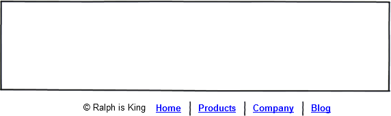
The Client in my made-up story is a cheap bastard that goes by the name of Ralph. He is somewhere between an Under-Valuer and a “I-Could-Do-This-Myself”-er (on how to deal...), and Ralph wants you to add this footer to his website (The big EMPTY box here is the lower part of his website's content):
What most designers would do
Most designers would line up the text in a single paragraph, using the vertical bar symbol as separator for the menu items:
<p id="footer"> © Ralph is King <a href="/privacy-policy" title="Privacy Policy">Privacy Policy</a> | <a href="/terms-and-conditions" title="Terms and Conditions">Terms and Conditions</a> </p>
Then, “most designers” would use this very simple CSS rule to center the whole thing horizontally:
#footer {
text-align:center;
}
We're not most designers. We like semantic markup that's flexible. Flexible as in easy to change in the future.
Our own semantic and flexible markup
Here it is. It uses an unordered list for the links, and puts the Copyright notice in a paragraph. That paragraph could have been a span, it doesn't matter.
<div id="footer"> <p class="copyright">© Ralph is King</p> <ul> <li class="first"> <a href="/privacy-policy" title="Privacy Policy">Privacy Policy</a> </li> <li> <a href="/terms-and-conditions" title="Terms and Conditions">Terms and Conditions</a> </li> </ul> </div>
Yep, I know, I'm getting ahead of myself with that class attribute set to “first” for the first list element. I'm already thinking of a way to insert that vertical line separator between links with CSS. Let's style that list. Same old here. Too many lines for my taste. Scroll down.
#footer ul {
  list-style:none;
  margin:0;
  padding:0;
}

#footer li {
  float:left;
  padding:0 10px;
  border-left:1px solid #fff;
}

#footer li.first {
  border-left:none;
}

/* Love Hate, etc. */

#footer li a:link, #footer li a:visited {
  font-size:12px;
  line-height:12px;
  color:#1b9d95;;
  display:block;
  text-decoration:none;
}

#footer li a:hover, #footer li a:active {
/* TO DO. I am not inspired */
}
I am using a CSS border to replace the pipeline used in the mainstream designer's solution. I'm good.
Now with the first real challenge
How do you shrinkwrap an element
If it's an inline element, you have to do nothing to “shrinkwrap” it.
If you have a block element and you want it shrunk to fit the size of its content, you can do a few things: float the element, or set its display to “inline-block”, or set its position property to “absolute”. For all the details about the Shrinkwrapped Model Extent, please read pp. 102-103 of the excellent book Pro CSS and HTML Design Patterns by Michael Bowers. The page for the Shrinkwrapped pattern on the Companion Website of the book is here. I can't say enough good about Bowers' book.
Let's float the shit out of our copyright notice and link list.
#footer .copyright, #footer ul {
  float:left;
}
Now how do we center all this?
How do you shrinkwrap and center a block element
For this solution, you have to wrap in a div element whatever-it-is-you-wish-to-center. Let's add some presentational markup to our HTML. Let's add an 'inner' div.
<div id="footer"> <div id="footerInner"> <p class="copyright">© 11 Heavens</p> <ul> <li class="first"> <a href="/privacy-policy" title="Privacy Policy">Privacy Policy</a> </li> <li> <a href="/terms-and-conditions" title="Terms and Conditions">Terms and Conditions</a> </li> </ul> </div><!-- end of #footerInner --> </div><!-- end of #footer -->
#footer {
  right:50%;
  position:absolute;
}
#footerInner {
  left:50%;
  position:relative;
}
What the hell is going on here?
The inner div, #footerInner, is positioned relatively and then offset to the left by 50% of the width of its container, #footer.
The outer div, #footer, is positioned absolutely to shrinkwrap around our inner div, #footerInner. It is also offset to the right by 50% of its container, the body.
As a result, the whole thing is centered on the page in IE7, IE8, Firefox, Chrome, Opera and Safari.
PS: Nothing comes after the footer, but still it's good practice to "clearfix" any block element that only contains floated content, so let's apply overflow:hidden to our #footerInner container. That's the new Clearfix:
#footerInner {
  overflow:hidden;
  left:50%;
  position:relative;
}
A demo on this page please
Let's say I have a block element. I don't know in advance which width it will be. In most cases, it will be a horizontal-bar-style menu with an unknown number of links in it.
<ul id="example" style="list-style:none;border:1px solid red;overflow:hidden;">
  <li style="float:left">Link1</li>
  <li style="float:left">Link2</li>
</ul>
This is our list, this is not a picture:
- Link1
- Link2
We will shrink-wrap it and center it.
<div style="position:absolute;right:50%;">
  <ul id="example" style="list-style:none;border:1px solid red;position:relative;left:50%;overflow:hidden;">
    <li style="float:left">Link1</li>
    <li style="float:left">Link2</li>
  </ul>
</div>
Not a picture:
- Link1
- Link2
The following proposition has been proven wrong!

I hope you enjoyed this. It was put together by me while I was sick with the flu. Not bad for a sick woman.
A word about Flow and absolute positioning
Positioning an element “absolutely” removes it from the Flow. Other elements around an absolutely-positioned element become unaware of it. The outer div in this Pattern is positioned absolutely and hence is removed from the Flow. This was not immediately apparent to me the first time I played around with this Pattern because I did not have any content below my footer in my design. If you use this technique in another context, be aware of this. You won't run into any problems if you use this technique to center a piece within a sized element, for example: if you apply the Pattern on a menu in a sized header. I routinely use absolute positioning for elements that are 'inside' a sized #header — “inside” as in: my absolutely-positioned elements are children of my #header div in my markup.

Here's an excerpt from Pro CSS and HTML Design Patterns (I have the PDF too):
About Absolute Box. Page 91: “When left, right, top, and bottom are all set to auto, a browser renders the absolute box in the same position it would have had if it were rendered in the normal flow.”
Now I understand the behavior of the outer div in my Pattern. Let me recap: my outer div is positioned absolutely, with the “right” property set to 50%. Nothing is specified for the “width”, and nothing is specified for “top”, “bottom”, and “left”. The CSS for it is:
#footer {
  right:50%;
  position:absolute;
}
That's the same as writing explicitly:
#footer {
  width:auto;
  height:auto;
  left:auto;
  right:50%;
  top:auto;
  bottom:auto;
  position:absolute;
}
Because both “top” and “bottom” are set to auto, the div is vertically positioned exactly as if it was a static element. However, it really is not. A static element. It has been removed from the Flow. Hence, the content that follows rises us (so to speak), behaving as if my outer div was not there. That's why I added some forced white space (very inelegant to say the least) below my demo code, meaning: I added my cheeky <br /><br />. It's not so much that an absolutely-positioned element needs to be cleared, it really is on a different layer (plane of existence). With that in mind, everything becomes quite clear — to me!
So really, Bowers should have added:
About Absolute Box. Me: “When top and bottom are both set to auto, a browser renders the absolute box in the same VERTICAL position it would have had if it were rendered in the normal flow. When left and right are both set to auto, a browser renders the absolute box in the same HORIZONTAL position it would have had if it were rendered in the normal flow.”